
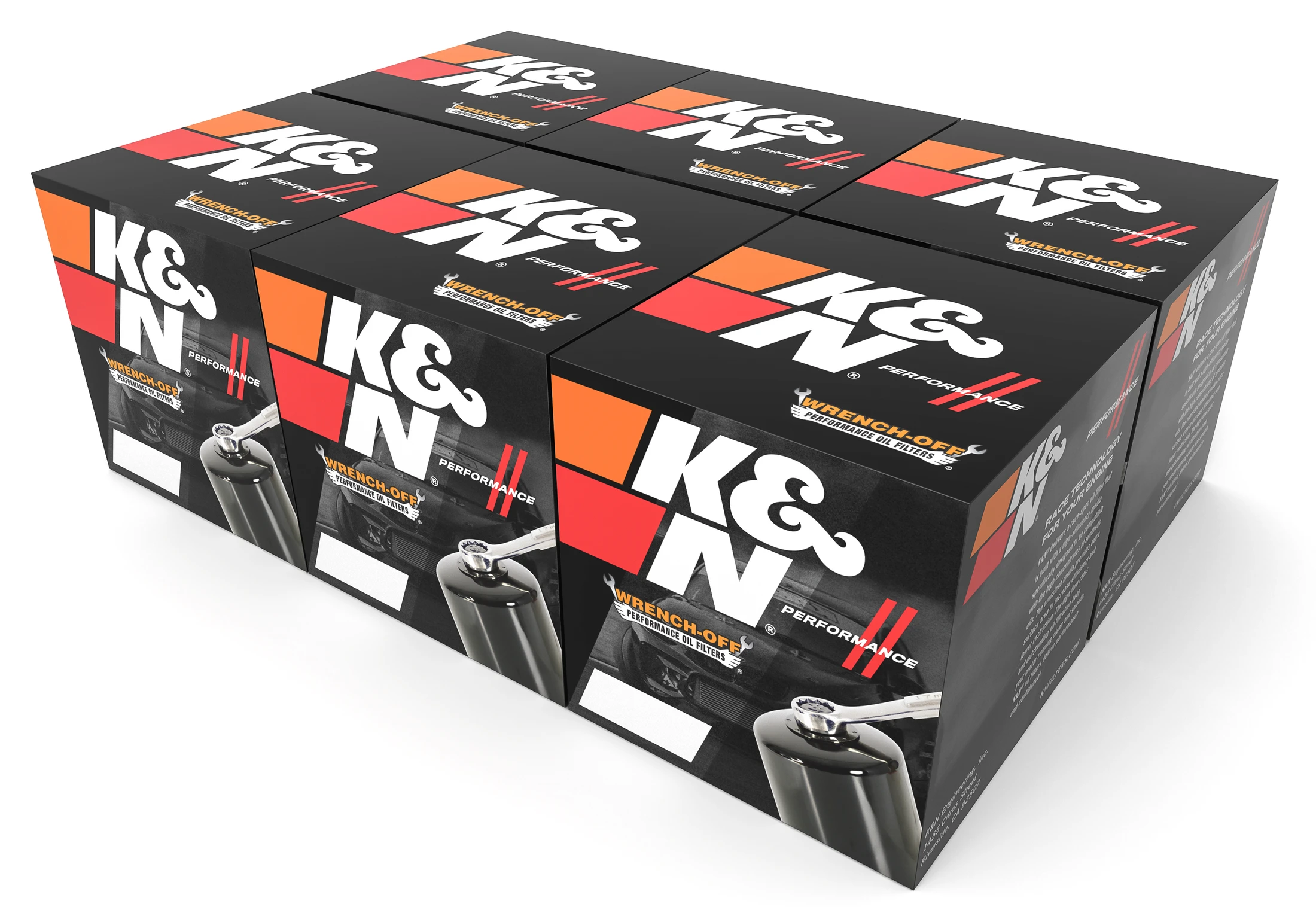
K&N was in the middle of a brand refresh and wanted to explore where the packaging could go. The brief: bring something fresh to the oil filter line without losing what makes K&N instantly recognizable: the racing heritage, the bold logo, the performance attitude that fans already know on sight.
The work needed to live in the real world of retail packaging: produced as SBS (solid bleached sulfate) folding cartons, efficient to print and assemble, and consistent across a range of filter sizes, while still feeling like a step forward for the brand.
The goal was evolution, not reinvention. Each concept holds onto the heritage cues that define K&N (the signature logo, the orange-to-red performance accents, the high-contrast black) and explores new ways to arrange them: panel hierarchy, photography treatment, how the logo anchors each face, and how the system reads across single units and multipacks.
Every concept was developed as a buildable SBS folding carton, so the ideas weren't just surface graphics. They accounted for structure, panel layout, and how each face works on a real box on a real shelf.
A range of folding-carton directions presented to the K&N team, each one keeping faith with the brand's heritage while pushing the layout, hierarchy, and shelf presence somewhere new. All shown as SBS carton studies.
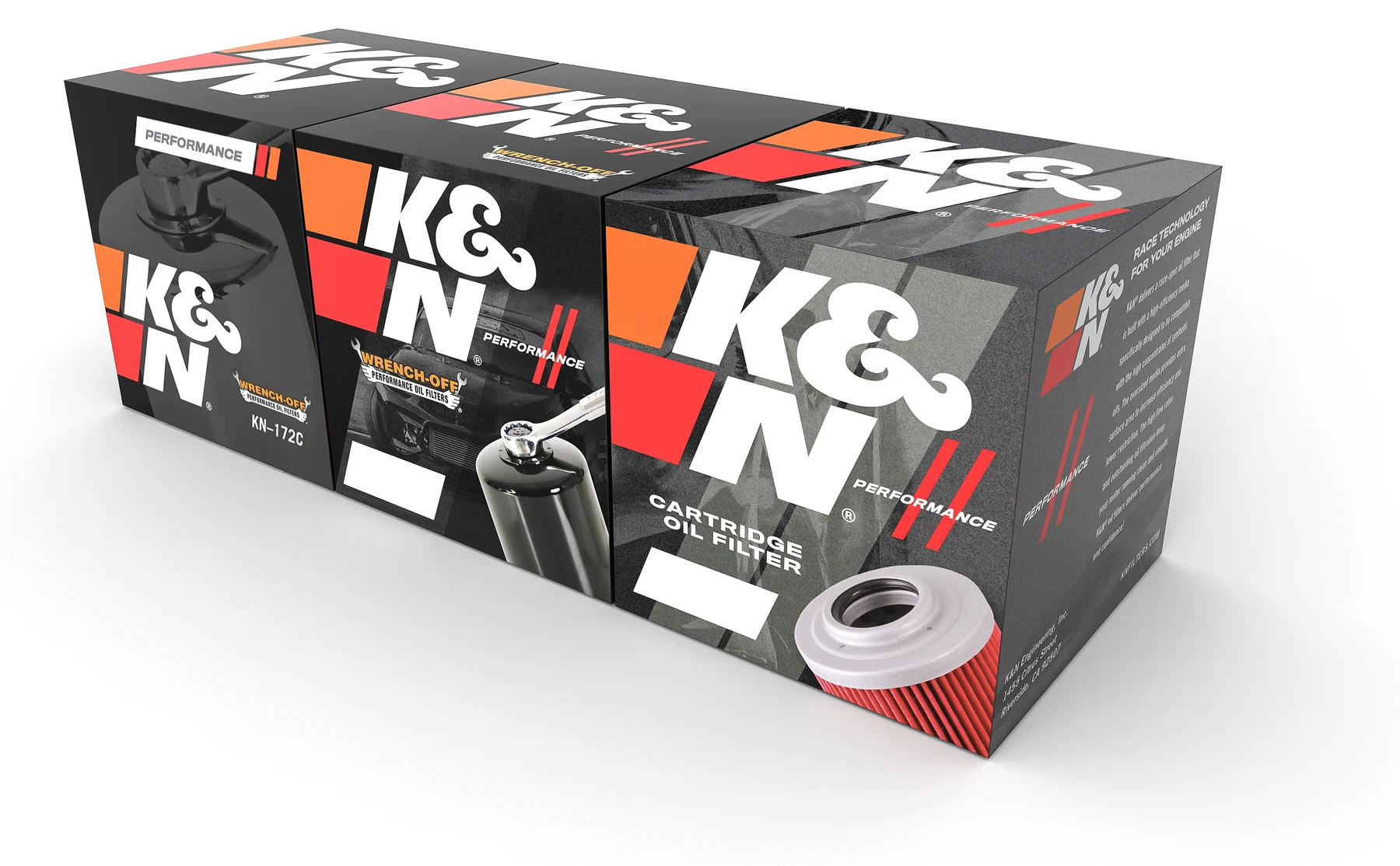
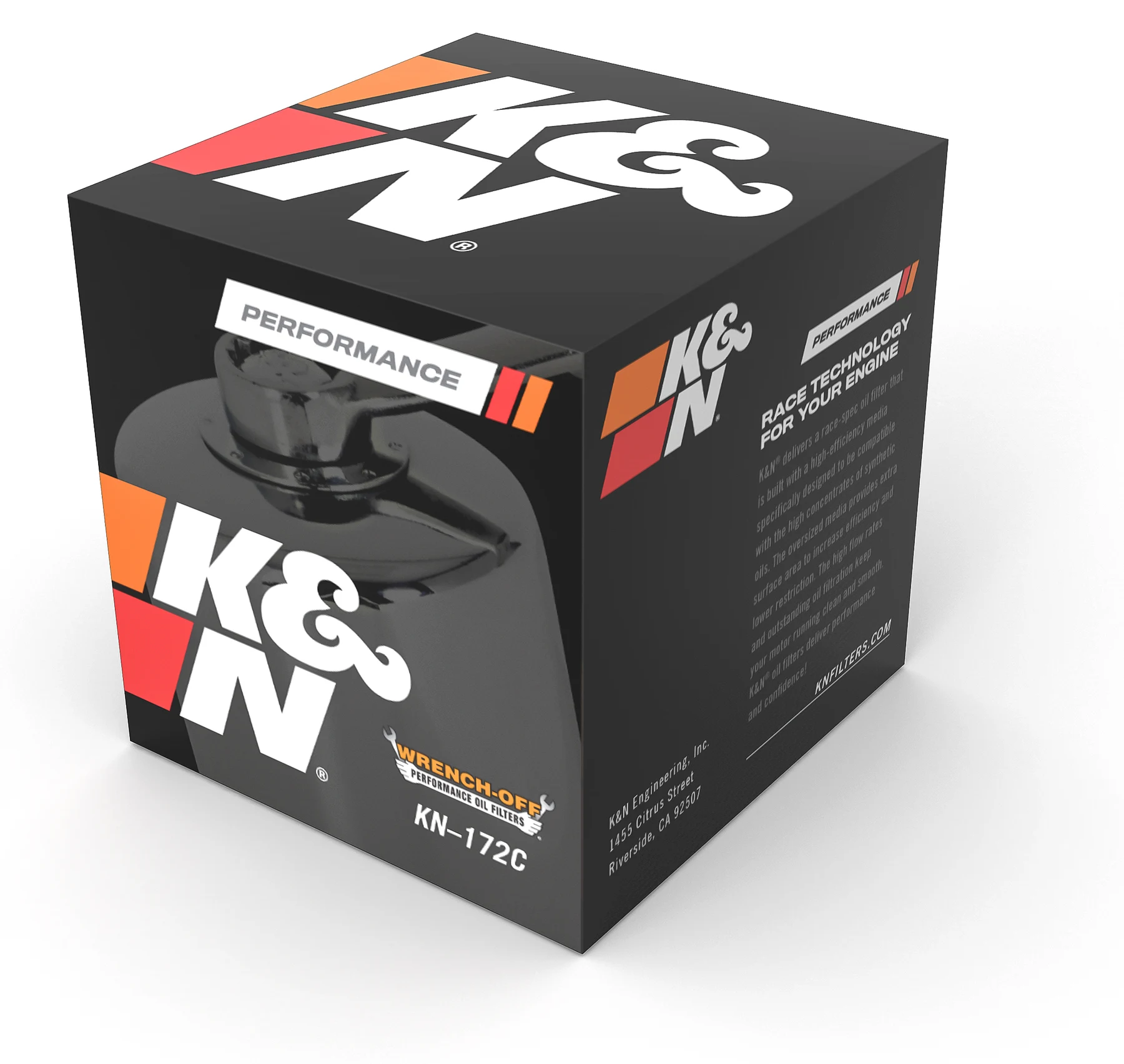
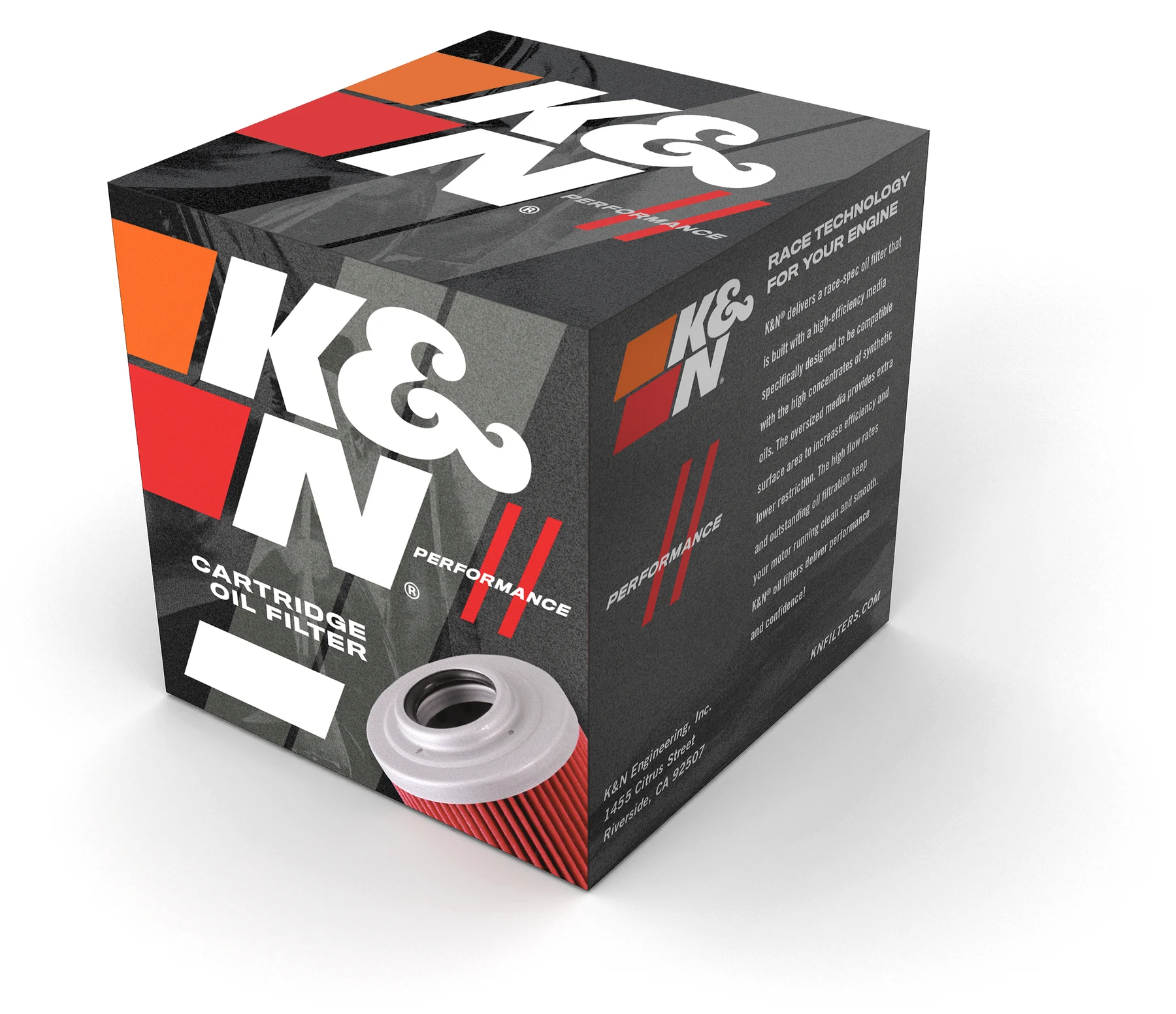
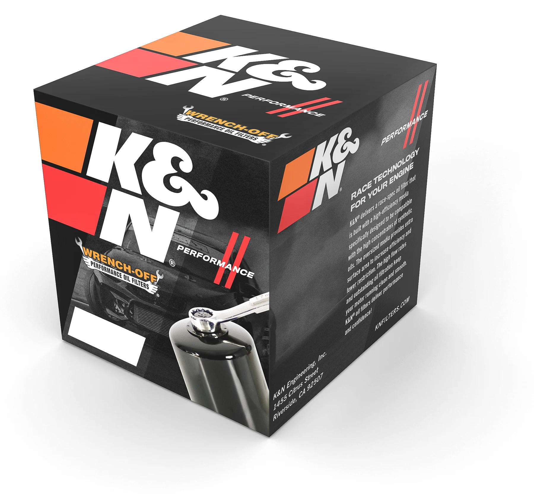
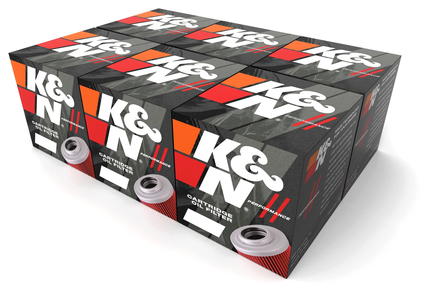
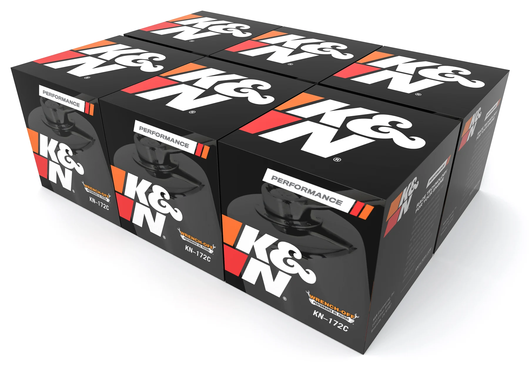
The result is a set of distinct directions that each answer the same question differently: how do you move K&N forward without letting go of what fans already love? Presented as a range of buildable SBS concepts, they gave the team real options to react to: a starting point for the refresh, not a single forced answer.
This kind of heritage-aware exploration, pushing a brand forward while respecting the equity it's already built, is the thinking DKCD brings to every brand-refresh and packaging engagement.